Breakpoints
Firstly, you need to add the breakpoints for each screen size in _breakpoints.scss. We have the maximum values used as SCSS variables and the $breakpoints object that uses the value of the next (smaller) breakpoint to create media queries using the min-width (mobile first) approach.
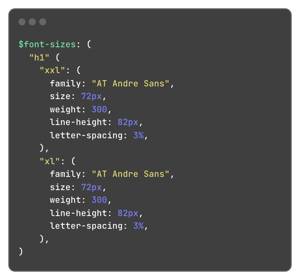
Fonts
After creating the breakpoints you need to edit the $font-sizes object in _typography.scss that contains all the available headings with their details for each breakpoint and looks like this: